What we do with the shadows
The title of this blog post refers to the mockumentary movie and TV show titled What We Do in the Shadows which follows a group of hilarious vampires. When it comes to video editing, however, shadows aren't scary at all. In fact, they can be extremely valuable for drawing attention and adding emphasis to key design elements. This blog post discusses the newly added shadow feature which is now available for all design elements in the Movidmo video editor.
Whether you are creating a marketing video or an educational video, shadows can be used to set content apart from background or to add depth to visual content. Most video editors only implement shadows for text captions, but at Movidmo, we decided to include shadows across the board for all the design elements that we offer.
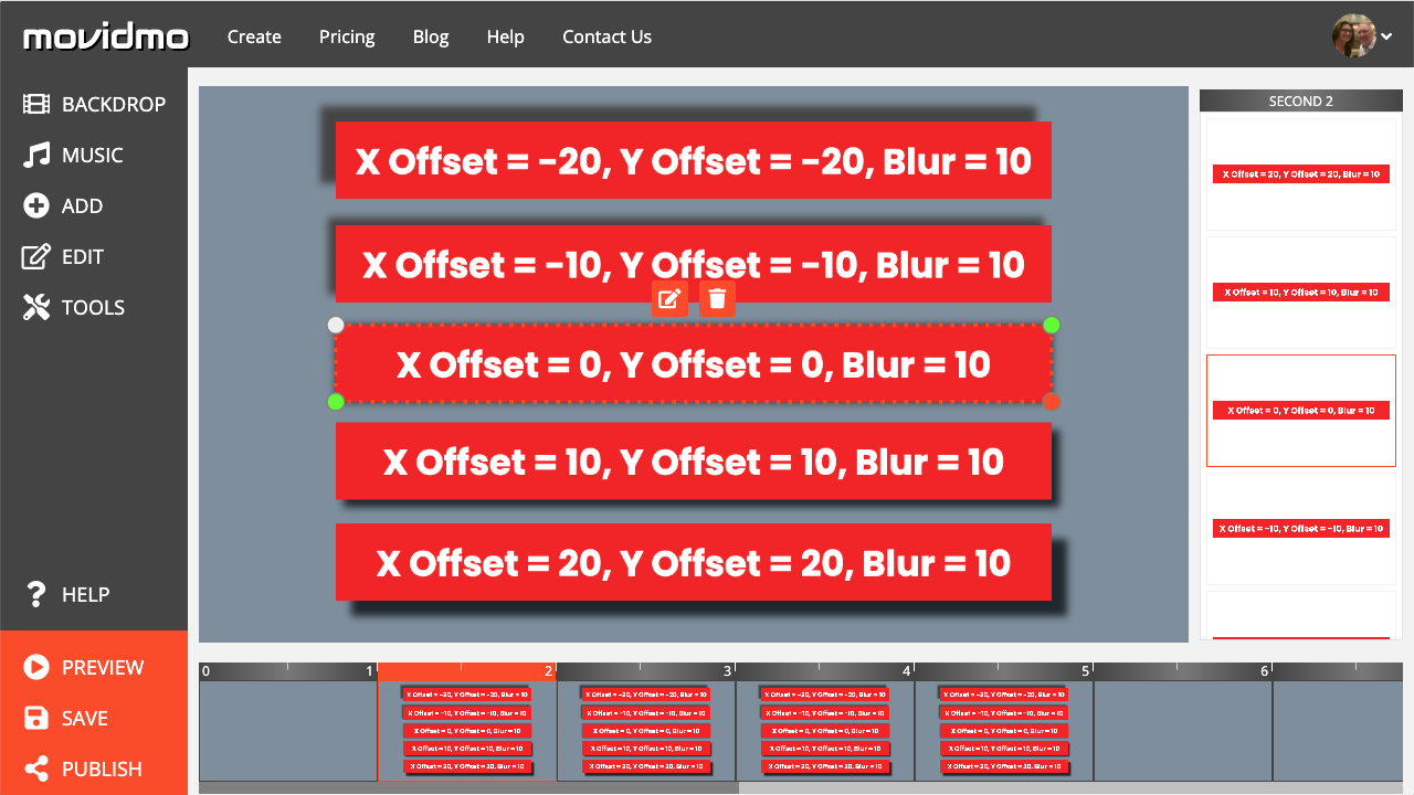
The shadow for an element is defined by a color, x offset, y offset and blur value. The x offset indicates how far the shadow should be horizontally spaced from the element, and the y offset indicates the shadow's vertical spacing from the element. The blur value indicates the level of blur to be applied to the shadow. For most design elements, the x and y offsets along with the blur value are defined as a percentage of the minimum value of the element's container width and height. This keeps shadows visually consistent as elements are resized. The offset input values are limited to the range from -20% to 20%. Positive x values shift the shadow to the right and down. Negative offset values move the content to the left and up. The blur value is limited to the range from 0% to 20%. A blur value of 0% means no blur is applied while a value of 20% represents maximum blur. The one exception to the above rule is a caption without a background color. For these captions, the offset and blur values are defined as a percentage of the font's height.
Inputs for each of these four parameters are displayed as a sequence in the Movidmo interface when a shadow is specified. The image below shows the shadow defined for a caption in the Plant A Tree Arbor Day video template. The shadow color is defined as rgb(68,68,68) which is a very dark gray color. In Movidmo, the color for the shadow may be defined from a set of standard colors, selected from media content, defined using an interactive color spectrum or by entering the HEX/RGB code for the color directly. Both offsets and the blur value are set to 5%. In this case, the caption does not have a background, so the font height is the basis for the shadow placement. At the caption's current size, the font height is approximately 70 pixels. Therefore, the shadow will be shifted to the right about 4 pixels and down about 4 pixels. The blur value of 5% means there is very little blur to the shadow so that the shadow is almost a solid color in this case.


Most designers may only think of using dark colors for shadows to set off light content from a darker background just as we have done in the above examples. However, lighter colors can also be used for shadows if the backdrop for the element in question is darker. In such cases, the shadow turns into an appealing glow around the element. For an example of this design technique, check out the Celebrate Black History video template. A screenshot of the wide version of this template is shown below. The image of Althea Gibson has white as a shadow color with both offsets set to 0% and a blur value of 5%.

It's worth pointing out that there are two ways to remove a shadow that has been placed on an element. When editing the element, the shadow color can be specified as empty or the values for all three remaining inputs can be set to 0%. In either case, the shadow input will show the value "None". This the default value for all Movidmo design elements as the shadow color is set to empty by default.
With four parameters used to define a shadow, there are a ton of possibilities associated with this new feature. We recommend trying several different values for each of these parameters as you design video content in the Movidmo editor. As always, we love feedback from our users about new features. If you find an example where shadows are particularly useful, please feel free to send us a link to the project using the Contact Us links at the top and bottom of this page.

